×
×BACK TO WORK

A mobile app that helps EV drivers find reliable stations, pay without friction and turn charging wait time into something useful — with rewards for charging at quieter times.
Competitive analysis
We evaluated four existing mobile apps: PlugShare, EVgo, Tata Power EZ Charge and ChargePoint.
- 01AdvantagesThe ability to filter choices, and reliable waitlist and charge-status updates.
- 02Pain pointsInaccurate locations, broken stations, waitlist malfunctions and poor integration of payment options.
- 03OpportunitiesClearer pricing information, fewer login steps and simpler ways to reserve a station.
Literature review and user survey
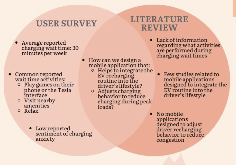
The original prompt was a smartphone app interface for EV charging station recommendation. Our literature review looked at how mobile charging apps influence EV drivers’ charging behaviour — 15 articles from 5 publication databases, all published after 2010. A preliminary survey of five EV drivers assessed their charging patterns and behaviour. Every participant owned a Tesla, had no additional ICE vehicle and was highly satisfied using the Tesla dashboard and navigation to locate charging stations. One reported charging anxiety.
- 01Intentions behind EV purchase
- 02Attitudes inhibiting EV adoption
- 03Charging infrastructure and its relationship to charging behaviour
- 04Current mobile apps that improve the charging experience
- 05Congestion control and charging-pattern prediction
Identified gaps in current designs
The survey and literature review revealed several inconsistencies. Barriers to EV adoption include drivers’ perceptions of long recharging periods, the inability to locate reliable charging stations and excessive wait times — along with questions about the capacity of the current electrical grid.
Proposed solution
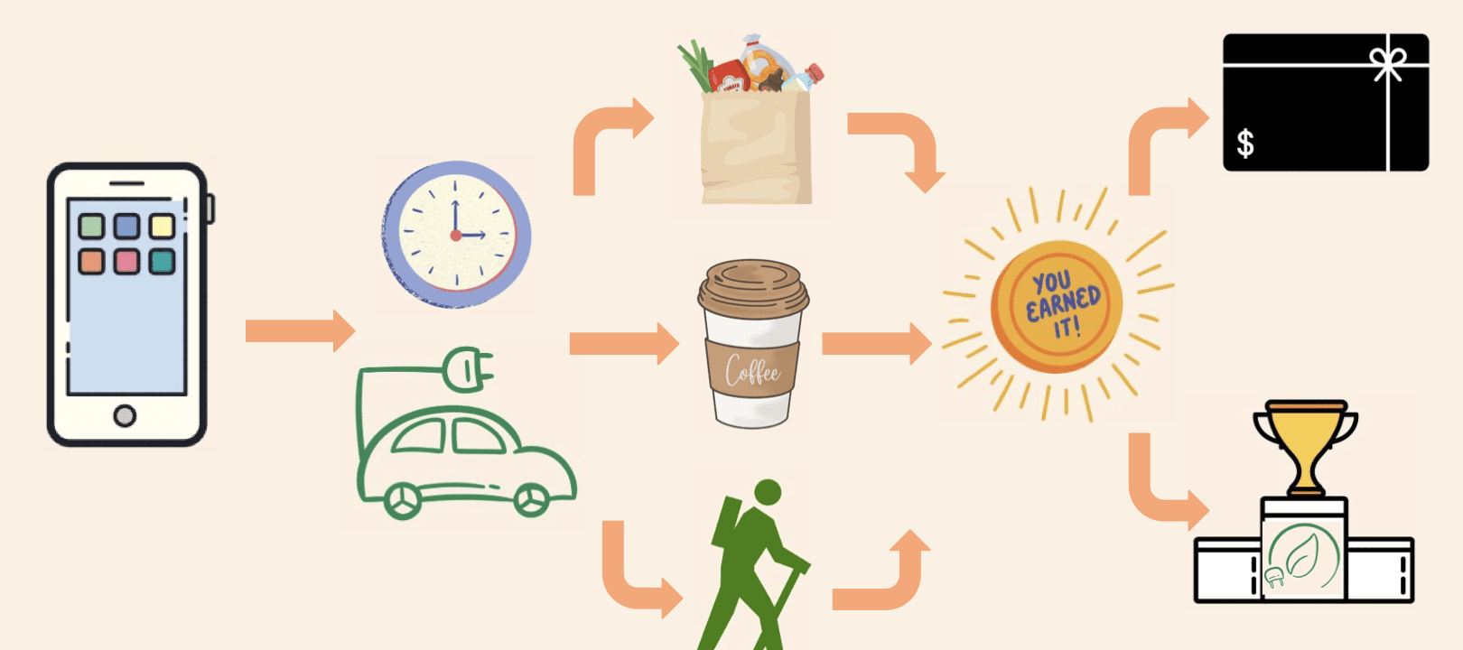
Current apps already cover the basics: locating and navigating to stations, a user-friendly interface, payment, customisable filters, user support and charging notifications. EV.Charge adds two novel features intended to influence behaviour.
- 01Be active outside the vehicleReframe the recharging routine so it fits the driver’s lifestyle.
- 02Charge at less popular timesReduce wait times, congestion and load on the electrical infrastructure.
Design process
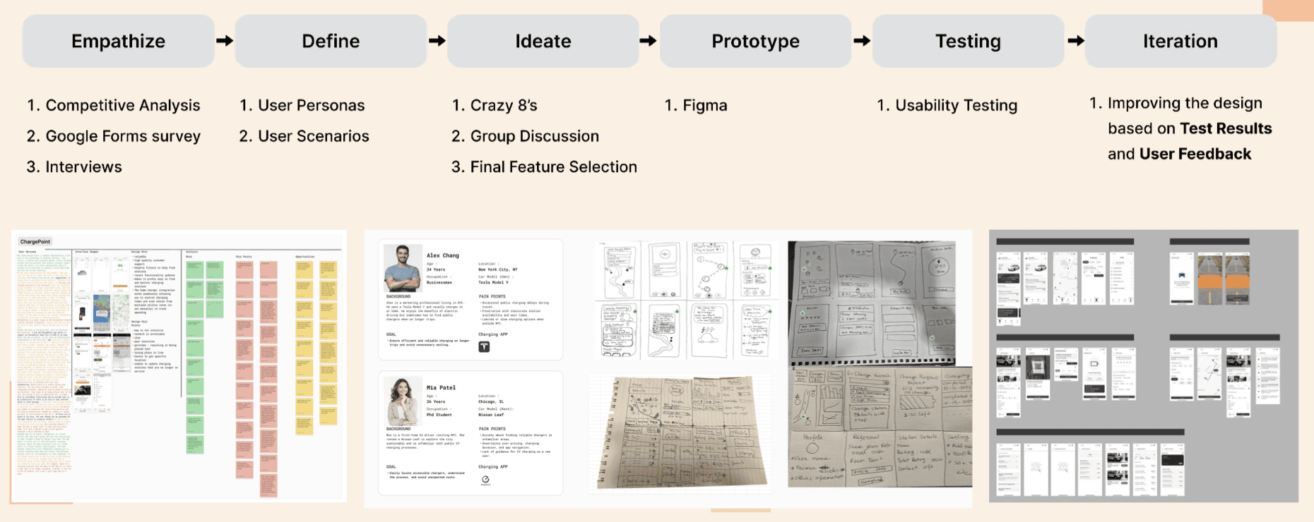
Empathize, define, ideate, prototype, test and iterate — from competitive analysis, a Google Forms survey and interviews, through personas, scenarios, Crazy 8s and group discussion, to a Figma prototype and usability testing.
Initial prototype design
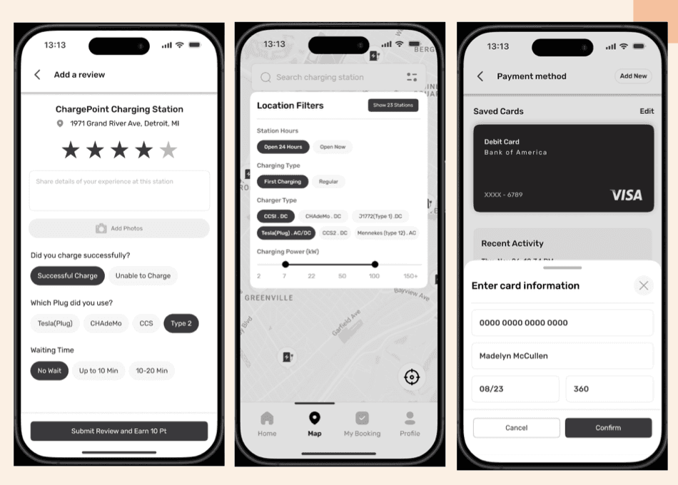
For the initial prototype we focused on three core task flows to address primary user concerns and establish the app’s core functionality.
- 01Meaningful charging-time activitiesReview stations, explore nearby amenities or play games for rewards.
- 02Customisable filter criteriaFilter stations by charger type, real-time availability and distance.
- 03Seamless payment integrationQuick, secure payments via multiple methods (credit cards, wallets).
Usability testing
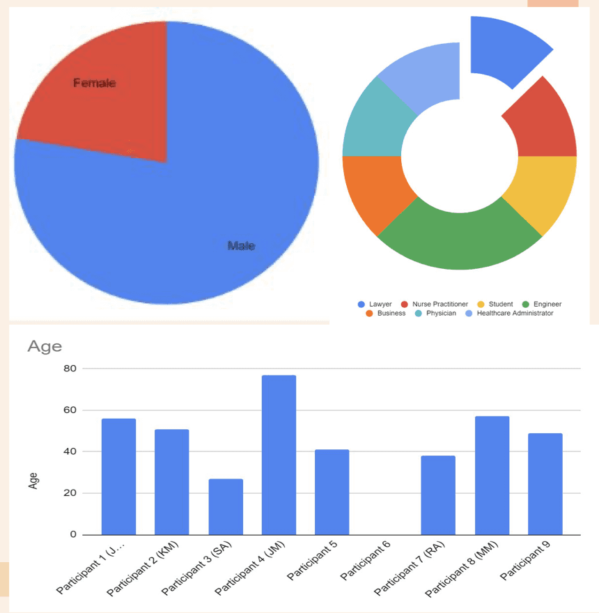
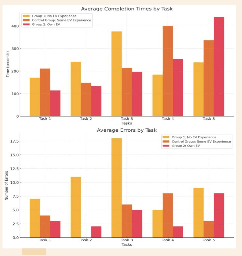
A between-group study: Group 1 had never driven an EV, the control group had driven one but did not own one, and Group 2 currently owned an EV. Our hypothesis was that EV owners would make fewer errors and complete tasks faster, thanks to their familiarity with similar technology. We measured task time and number of errors, and collected feedback on navigation and overall satisfaction.
- 01Task 1Locate payment methods and add one.
- 02Task 2Open the map, choose a charging station and save it.
- 03Task 3Schedule a reservation for later and read out any alerts.
- 04Task 4Get directions, start a charging session, view the charge and submit a review.
- 05Task 5Open the weekly challenge list, complete an activity and check your status.
Test results
Efficiency in task completion: the study did not show any evidence that EV owners took less time to perform a task. Error reduction: EV owners encountered fewer errors while performing tasks, indicating a better understanding and a better usability experience.
Participant feedback
- 01Where participants struggledFinding the rewards section, understanding what rewards could be used for, greyed-out icons that looked non-functional, the term “task” in the weekly challenge list, and a design with too little colour.
- 02Design bugsNo way back to the homepage from the charging station without stopping the charge, and weekly challenges hidden until a review was submitted.
- 03What they likedThe list of nearby amenities, the game option (with requests for more variety), earning rewards and the simplicity of the design.
- 04What it could changeSeveral said the rewards might encourage people to charge at public stations.
Improvement 1 — a clear way back home
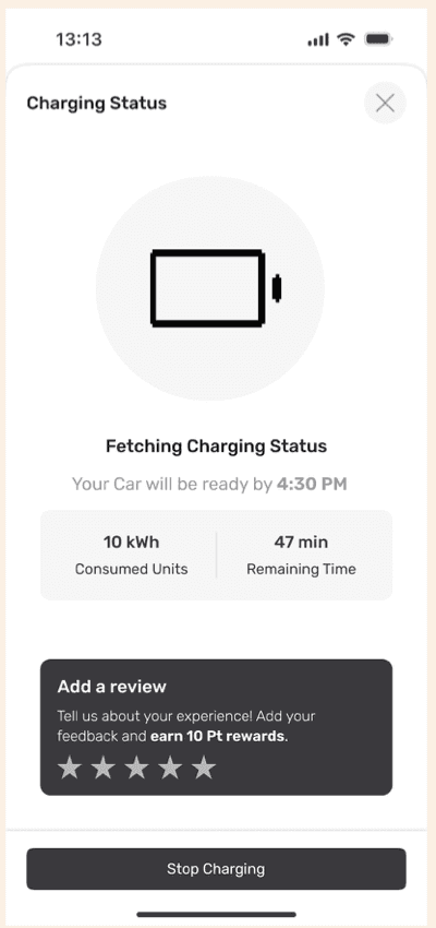
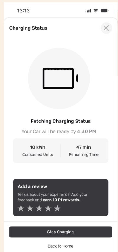
Users found the cross button confusing because it did not clearly mean “Back to Home”, and they often tapped “Stop Charging” by mistake. We added a secondary “Back to Home” button.
Improvement 2 — explaining rewards
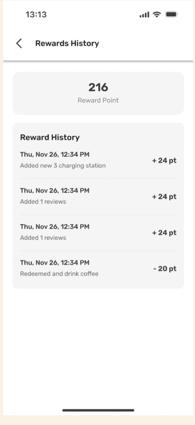
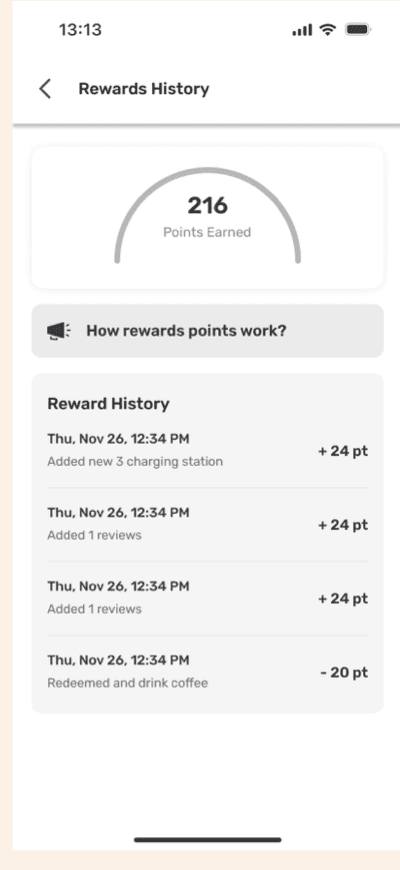
On the Rewards History page, users struggled to understand how to earn and use reward points. We added screens that explain how the rewards system works.
Improvement 3 — save from the list
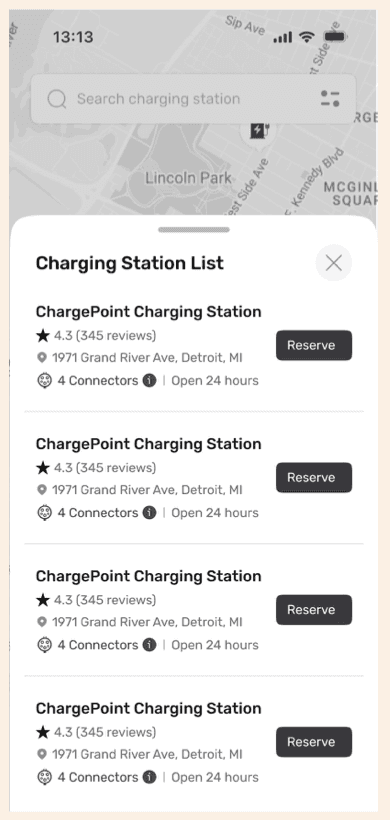
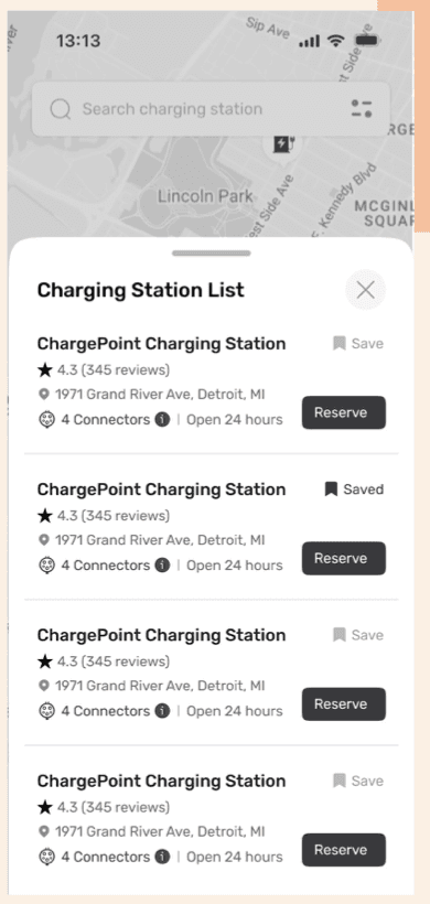
Some users wanted to save charging stations directly from the list view instead of opening the details page. We added a “Save Station” action on the list.
Prototype walk-through
Explore the clickable prototype to see how the app looks and works.
Open the Figma prototypeStrong with EV owners — work to do for newcomers
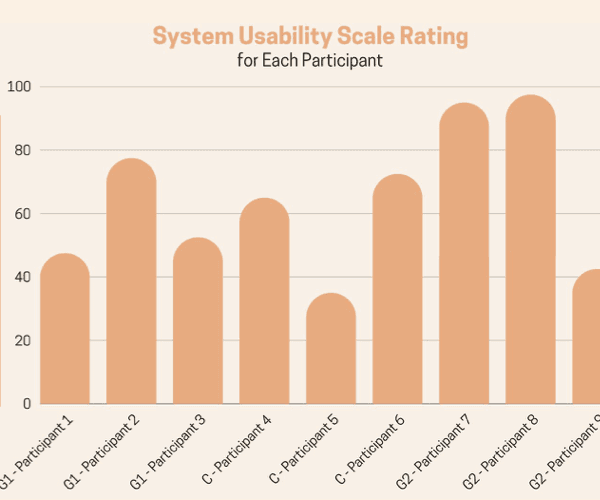
EV owners rated the app far more usable and made significantly fewer errors. Drivers with little EV experience scored below 60, so the app has to work for new EV drivers too.
The value of feedback: involving users at every step showed us which features they need and what causes frustration. We learned how EV drivers think, what challenges they face and what they expect from a charging app — easy payment options and better ways to find charging stations. By focusing on the main problems, like long wait times and confusing interfaces, we made a good start. Next steps: test with a wider group of people, refine the design using the feedback we already have, and prepare the project for the HFES conference.